Branding & Website Design for Hannah Choi, Life Coach
Project Overview:
Hannah Choi came to me in 2020 after securing her new role as a certified personal life coach. She was slowly building a clientele and wanted a website to direct to prospective clients as well serve as a digital marketing tool for future clients to find and contact her. To help her do this we utilized user experience (UX) principles as a foundation in creating a user-friendly and visually appealing digital experience.
About Hannah Choi, Life Coach:
Hannah is a life coach cultivating relationships with people aspiring to become a better version of themselves. She helps them accomplish their own goals and keeps them accountable. Her emphathic approach and personable sessions is what keeps her clients coming back. However, when her clients want to refer her to their friends, there is no streamlined way of reaching her to start a new customer journey. As her word of mouth marketing and business grows, she needs a website to capture all prospective clients new and reoccuring.
Project Goals and Objectives:
The primary goal of this project was to discover Hannah Choi’s Life Coaching’s personal brand and visual identity, discover identify her target audience, and create a user flow that makes sense for her clients in her website.
Website Objectives:
Branding and Identity: To help establish her online presence for clients to find her and learn about her services.
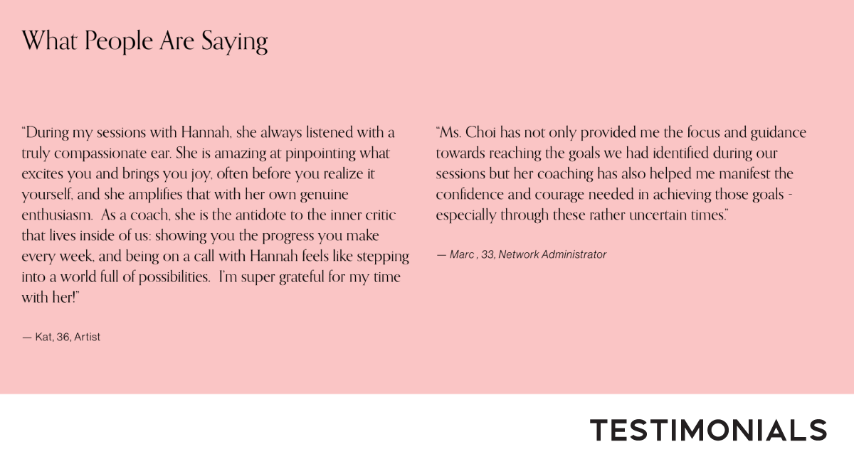
Showcase Expertise: Sharing testimonials, success stories, and personal growth blog posts to build trust and credibility.
Attract New Clients: The website will serve as a marketing tool and highlight the benefits of her coaching services and why potential clients should choose her.
Booking and Scheduling: Make it easy for potential clients to book coaching sessions and consultations with Hannah through her website with an online contact form.
Educate About Coaching and Process: Some people may not fully understand the benefits of a life coach. We wanted to educate visitors about her coaching process, methodologies, and the benefits they can expect.
Design Objectives:
Look and Feel: Professional, Trustworthy, Approachable, and a Safe Space for personal discovery.
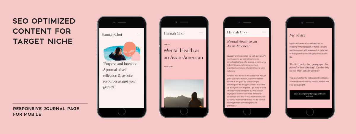
Mobile-Friendly: Ensure website will be responsive and works well on mobile phones and tablets.
Clear Navigation: Make it easy for visitors to navigate the website with a clear menu structure that guides them through the process and website.
Strong Visuals: Creating customer page headers with high-quality images and graphics that resonate with her coaching niche and personal brand.
Testimonials and Reviews: Showcase client testimonials to build trust and credibility.
Call to Action (CTA): Include a clear CTA user flow on each page of the website to encourage visitors to take the next step in scheduling a free consultation.
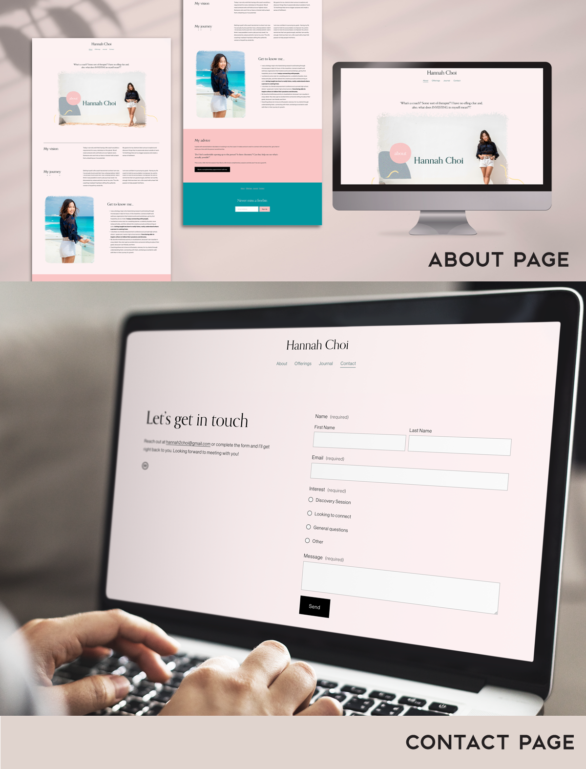
Contact Information: Ensure her email is readily accessible and include a contact form for visitors to communicate the following interests, (Discovery Session, Looking to connect, General questions, Other).
Content Strategy: Plan content strategy to provide valuable information and resources to target audiences with a blog. Help visitors picture themselves as a potential client of hers and have their self be seen.
SEO Optimization: Using relevant keywords within the journal entries to improve website visibility in search results.
User Research and Analysis:
At the early stages of the project, I had Hannah’s complimentary discovery session to experience it as an end user. My goals were to learn her client/coach relationship approach and to experience her process of onboarding a new client. I discovered that followup emails were very timely and maintained a relaxing, yet accountable safe space. The next step was sending out a survey and creating interview questions to collect data to figure out her target demographic and niche.
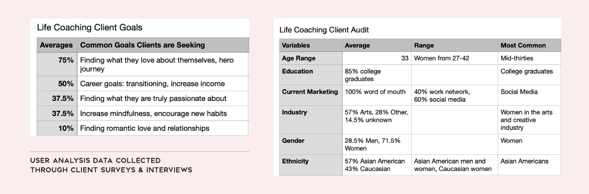
Some key findings from surveying her clients:
Current Marketing: 100% through word of mouth: 40% through work network, and 60% through social media.
Age Range: Average 33, Range lates 20s to 30s.
Education: 100% mention improving their careers in some shape or form: 85% college graduates, 14.5% seeking higher education.
Industry: Creative Arts industry
Most Frequent Coaching Topics: personal self discovery, working on career goals, identifying new habits and passions.
Largest Client Demographic: Asian American women in early 30s.
Branding
Design Essence and Personality:
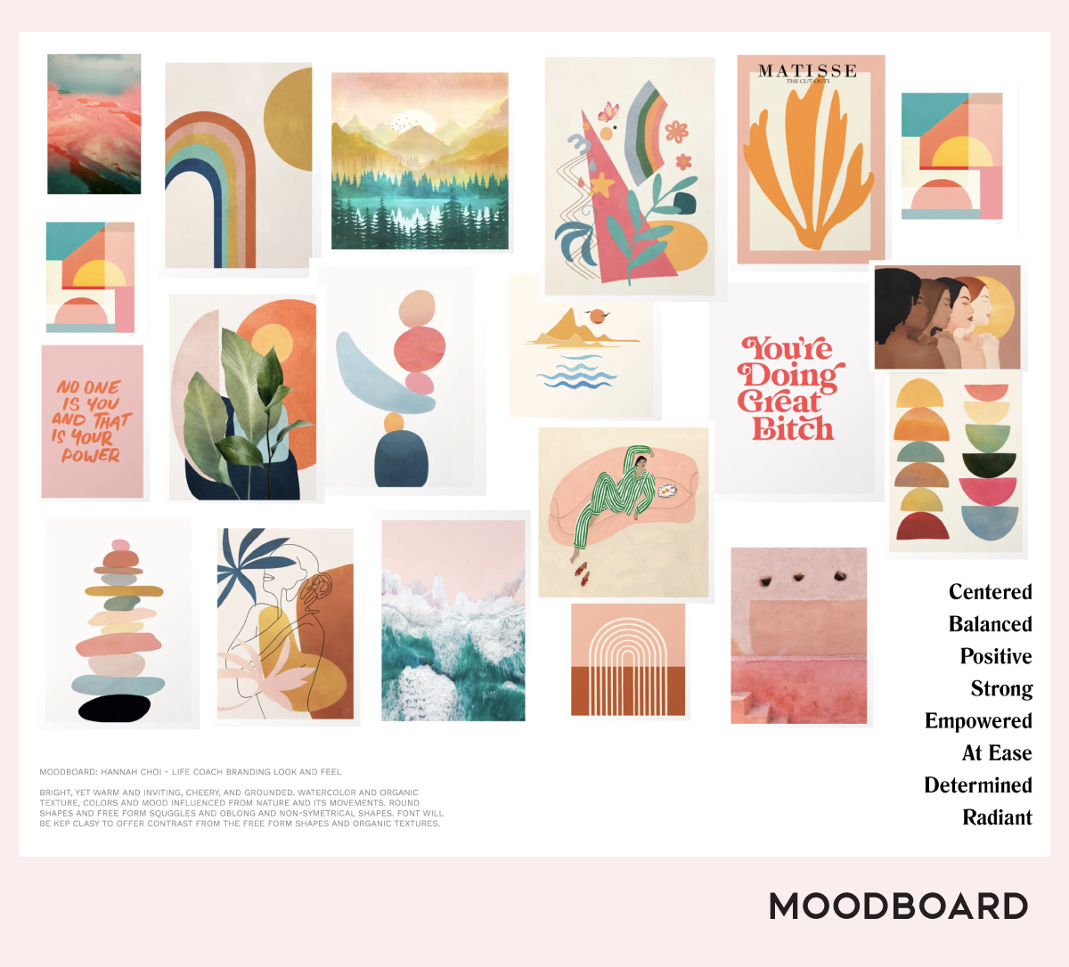
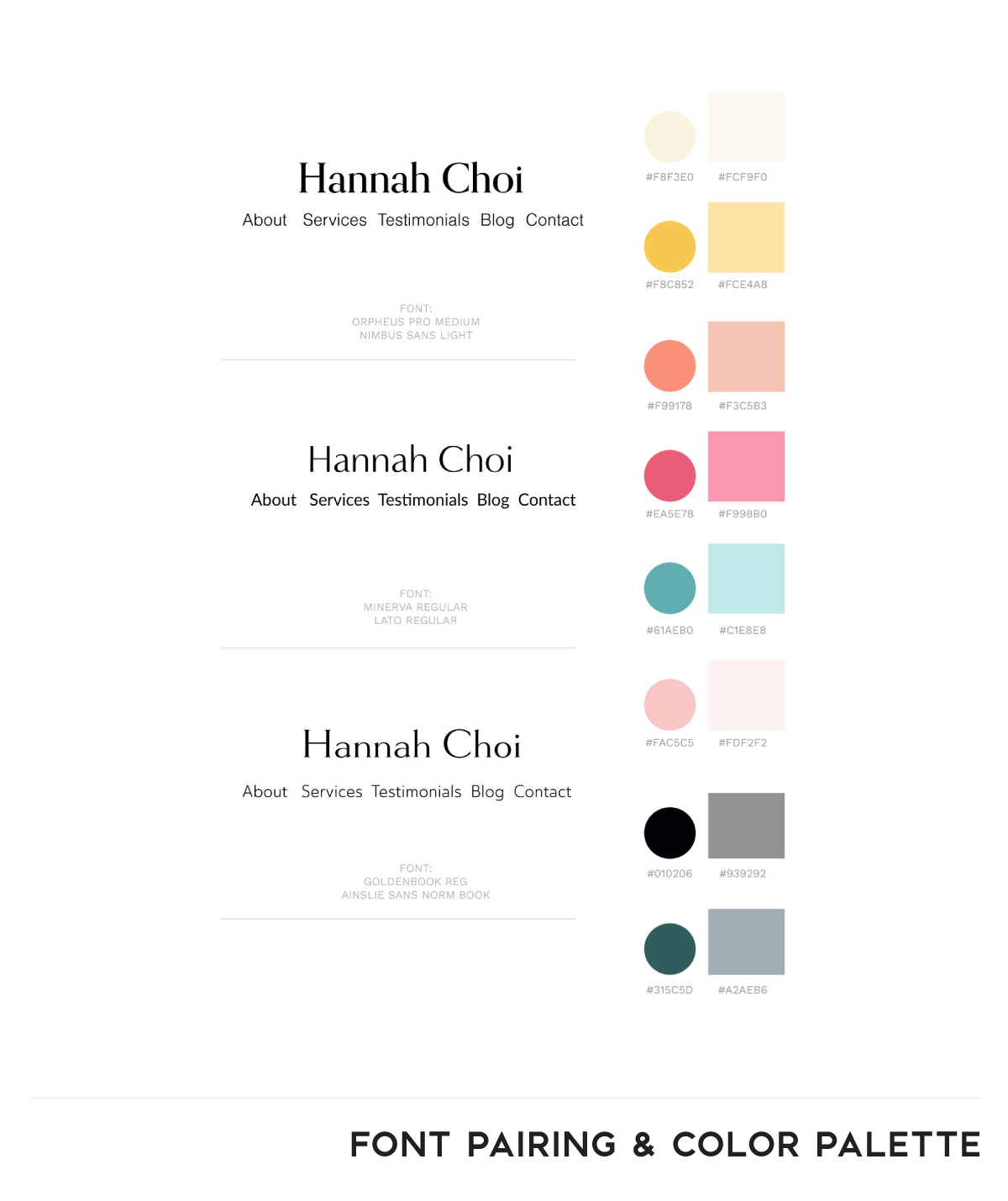
Bright, yet warm and inviting, cheery and grounded, watercolor and organic textures, colors and mood influenced from nature and its movements round shapes and free form squiggles and oblong and non-symmetrical shapes. Font will be kept classy to offer contrast from the free form shapes and organic textures.
Typography: A classy, serif font was chosen for the logo and branding materials to offer a contrast to the free-form shapes and organics textures.
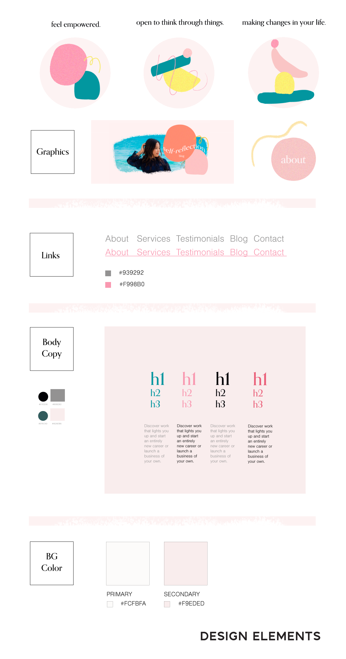
Graphic Design Elements: Used watercolor and Bristol brushes to create organic textures and designed free from squiggles, oblong and non-symmetrical shapes. These shapes illustrate a representation the the phases of Hannah’s life coaching technique.
Website Design
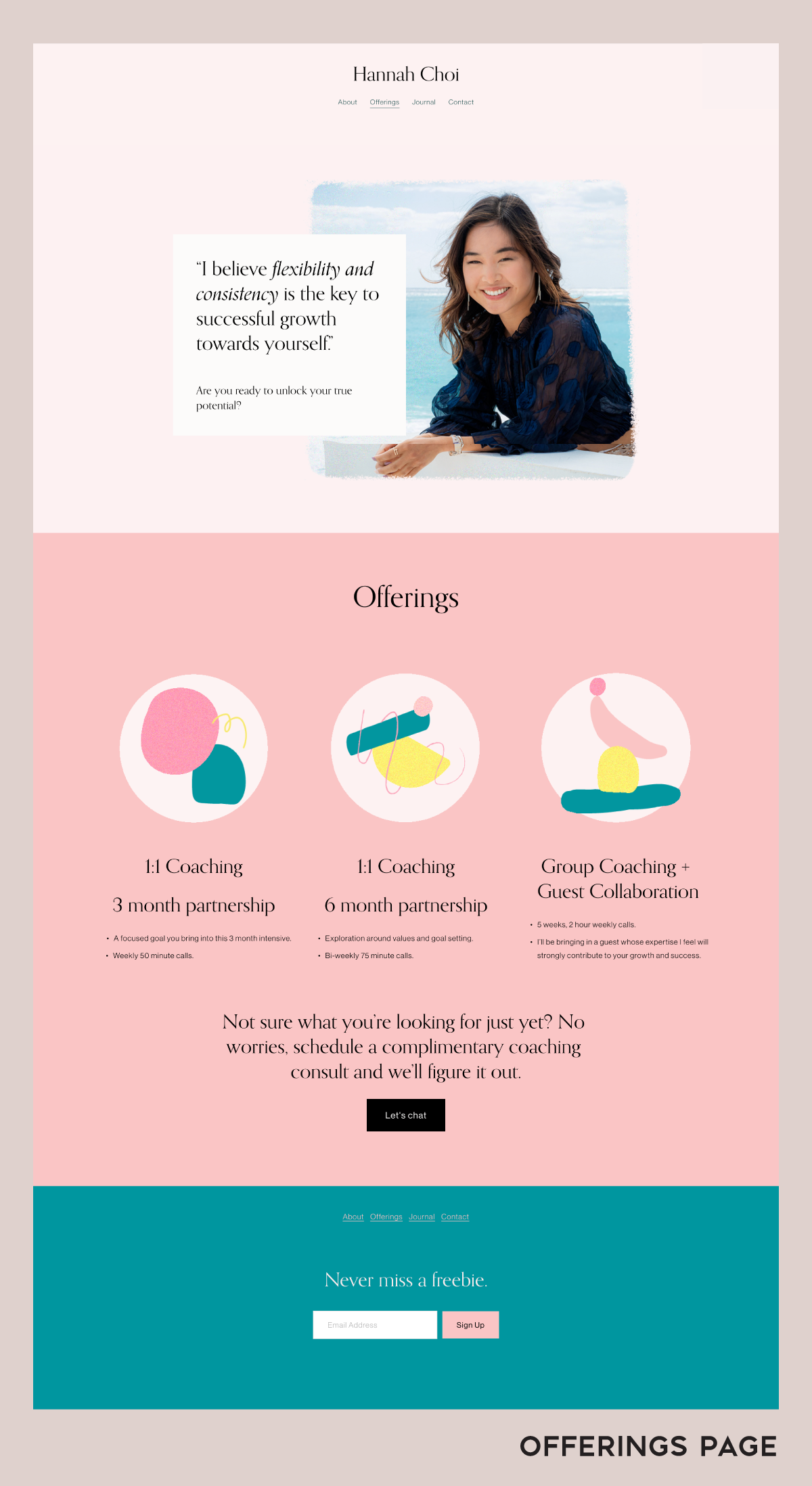
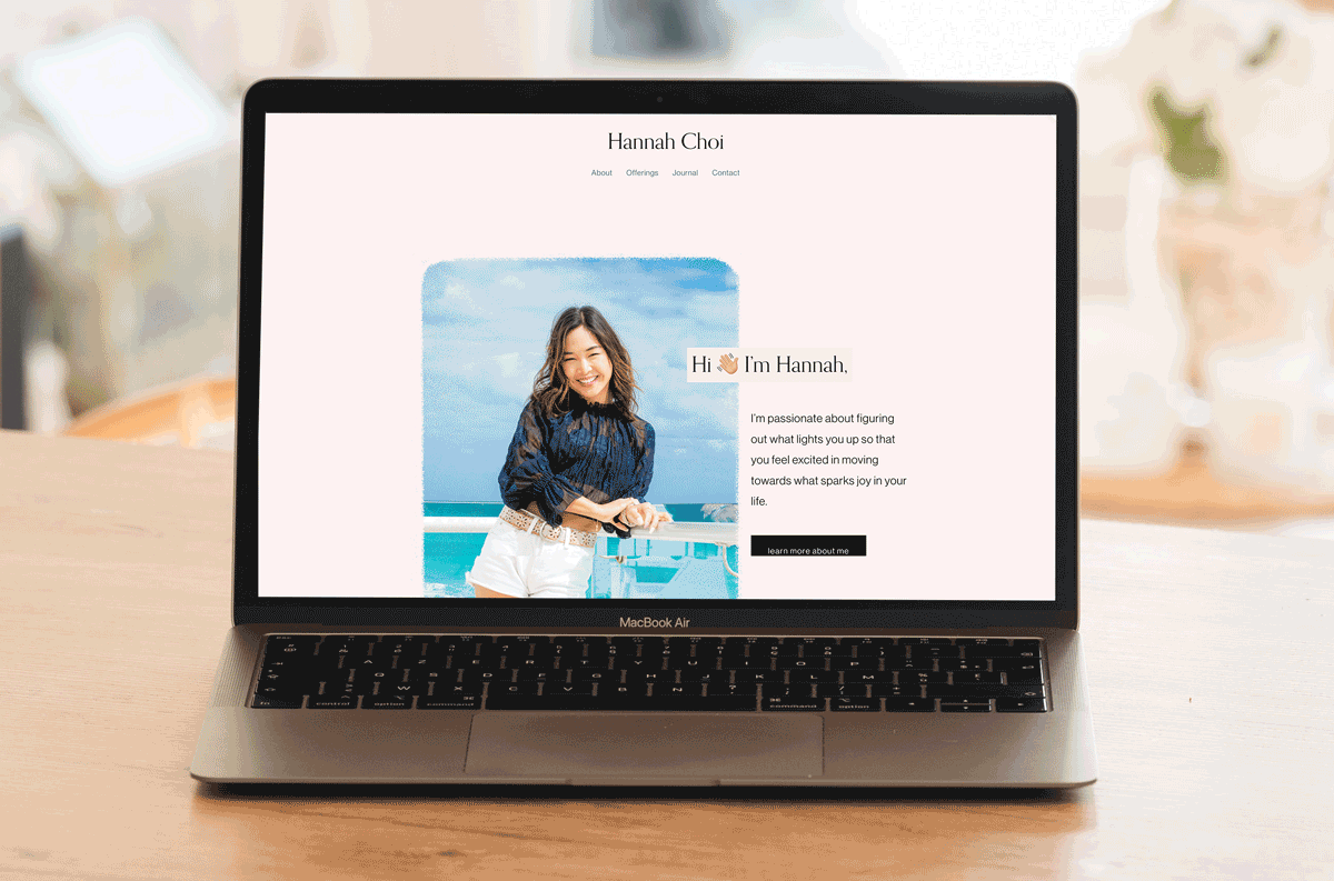
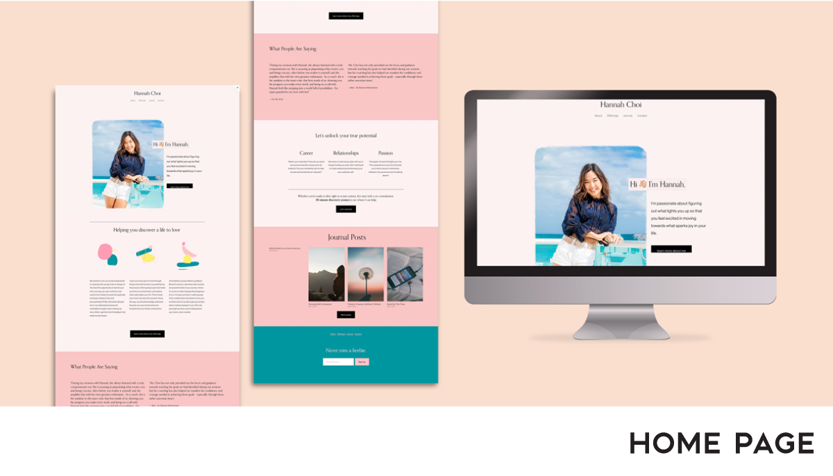
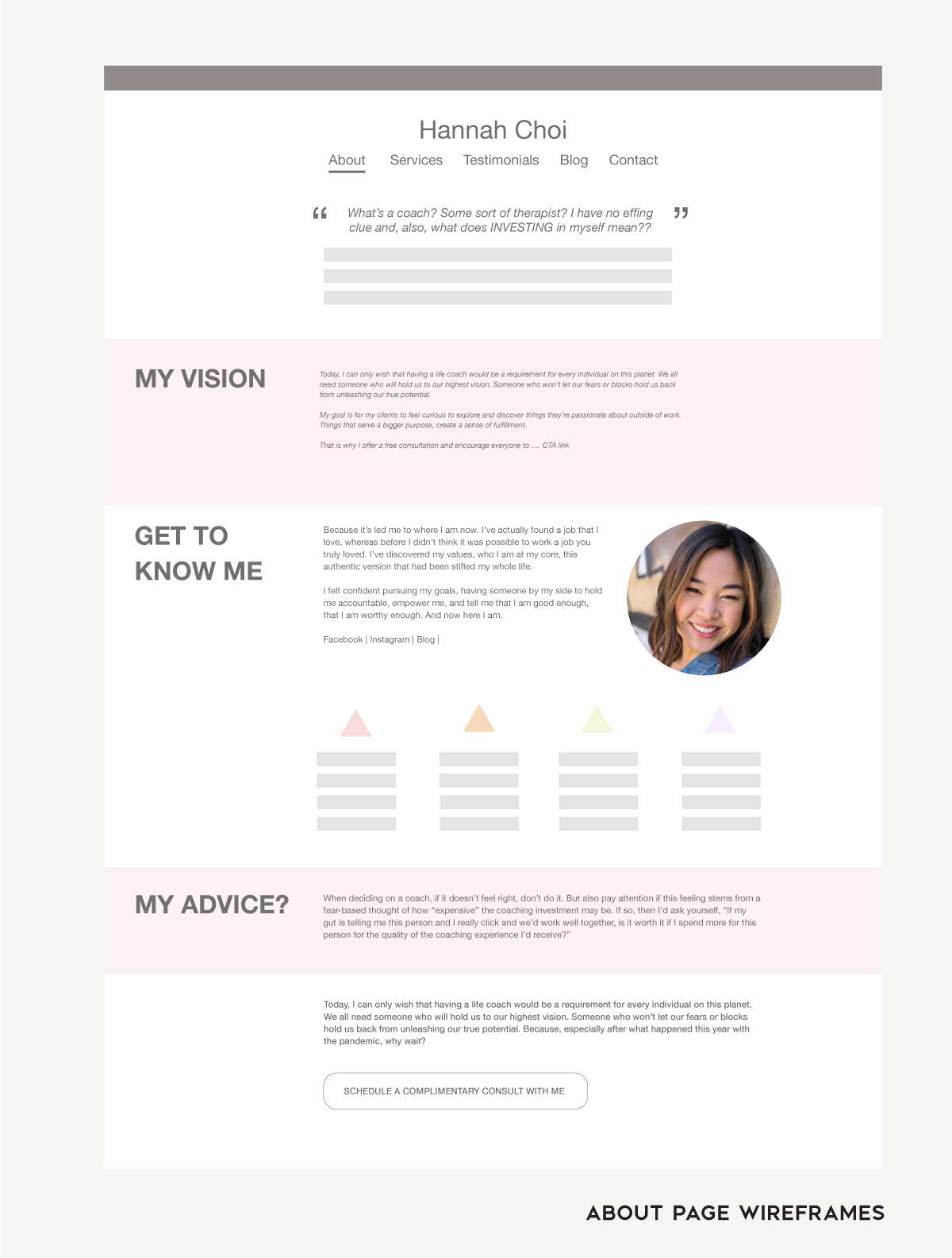
Wireframing: The website layout was carefully planned to create an inviting and intuitive user experience. Approachability was a main driver of the layout of the entire site. We wanted end-users to feel that it is a safe space to be able to explore into their deeper selves. I prioritize the layout of each page to be have a picture header with copy that proses a question to help draw more intrigue into the viewer to continue scrolling down to the CTA. Every single user flow on each safe ended with a CTA that put the viewer in a position to schedule a discovery session with Hannah.
Prototyping: I used Adobe XD to help plan the website experience, user flow, and to communicate to Hannah. Feel free to walk through them here: Hannah Adobe XD Wireframes
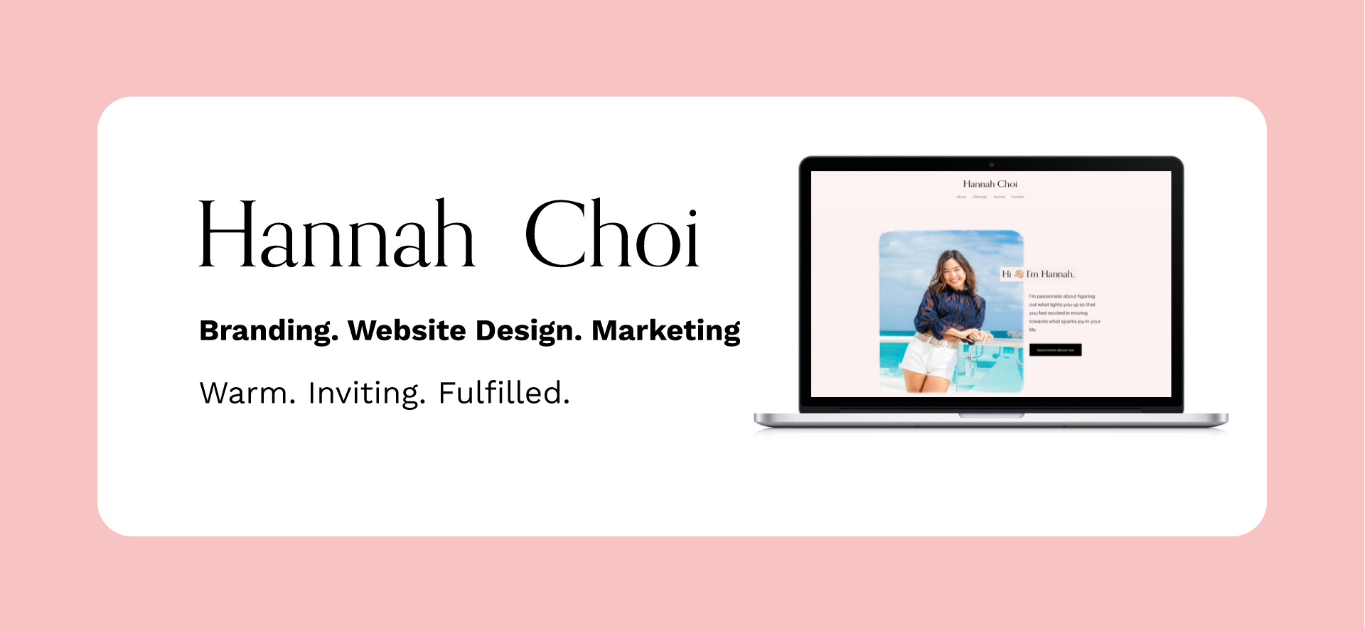
Visual Design: High quality photos of Hannah were used to create custom headers for each page to introduce Hannah as a life coach and was paired with a engaging prompt or question to answer the end-user thoughts they may have on that specific page.
I used a neutral light pink as a background color to create a warm an inviting color scheme. Color psychology suggests pink in can offer nostalgia comfort, calming energy, and approachable to encourage users to take the next step of committing to (CTA) scheduling an appointment with Hannah.